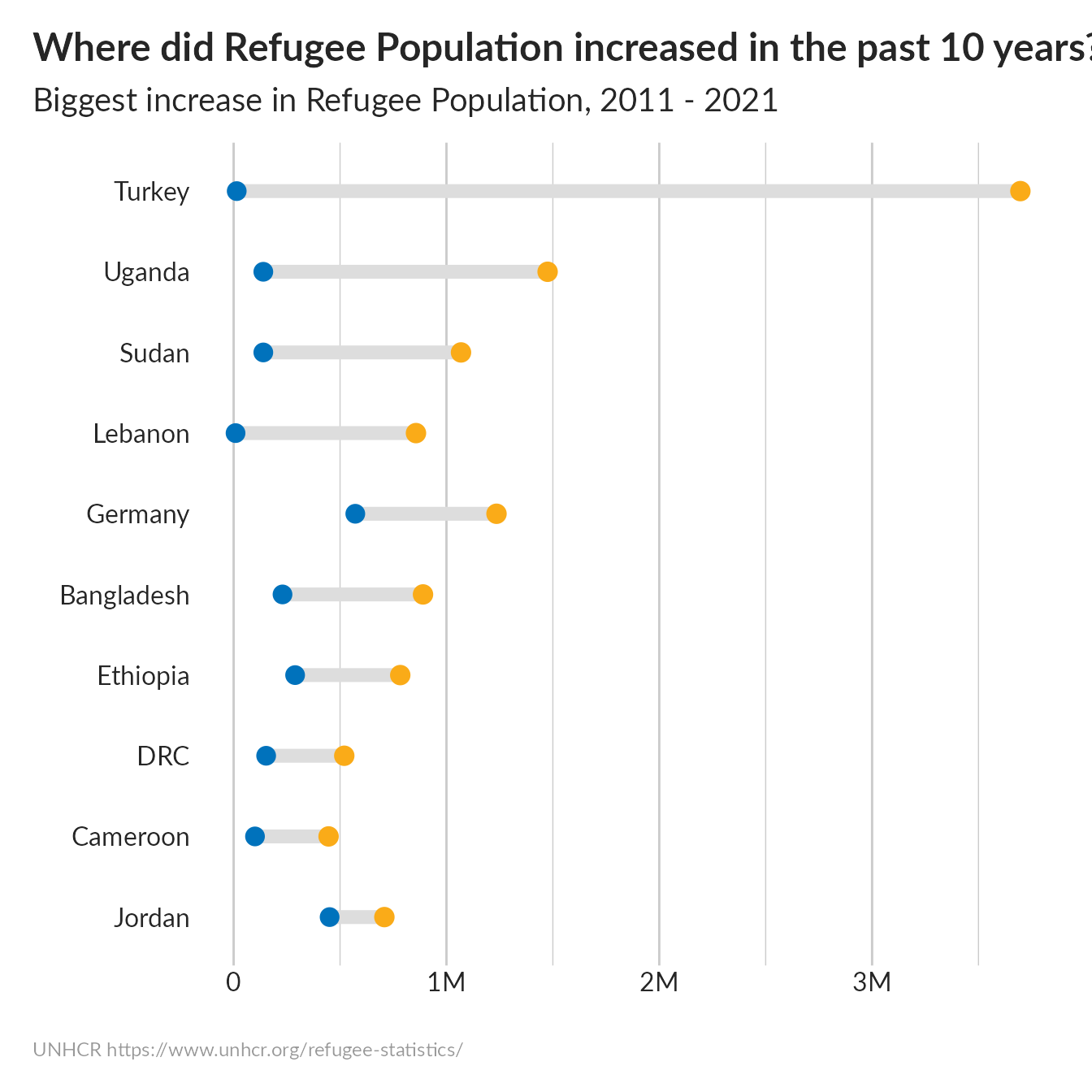
Biggest increase in Refugee Population
Source:vignettes/Biggest_increase_in_Refugee_Population.Rmd
Biggest_increase_in_Refugee_Population.RmdPrepare Data
## Loading the stat tables
lastyear <- max(unhcrdatapackage::end_year_population_totals_long$Year)
tenyears <- lastyear -10
## Loading the stat tables
data <- dplyr::left_join( x= unhcrdatapackage::end_year_population_totals_long,
                                                     y= unhcrdatapackage::reference,
                                                     by = c("CountryAsylumCode" = "iso_3")) %>%

    filter(Population.type  == "REF")  %>%
    filter(Year == tenyears | Year == lastyear) %>%
    group_by( CountryAsylumName, Year) %>%
    summarise(Value2 = sum(Value) )  %>%
    select(CountryAsylumName, Year, Value2) %>%
    mutate(CountryAsylumName = str_replace(CountryAsylumName, "Democratic Republic of the Congo", "DRC")) %>%
    mutate(Year = paste0("year_",Year )) %>%
    spread(Year, Value2) %>%
    mutate(gap = year_2021 - year_2011 ) %>%
    arrange(desc(gap)) %>%
    head(10)
#> `summarise()` has grouped output by 'CountryAsylumName'. You can override using the `.groups` argument.
Generate plot
ggplot(data, aes(x = year_2011, xend = year_2021,
                                   y = reorder(CountryAsylumName, gap),
                                   group = CountryAsylumName)) +
  ggalt::geom_dumbbell(colour = "#dddddd",
                size = 3,
                colour_x = "#0072bc",
                colour_xend = "#FAAB18") +
  labs(title = "Where did Refugee Population increased in the past 10 years?",
       subtitle = paste0("Biggest increase in Refugee Population, ", tenyears," - ",lastyear),
       x="", y ="",
       caption = "UNHCR https://www.unhcr.org/refugee-statistics/") +
  scale_x_continuous( label = scales::label_number_si()) + ## Format axis number

  unhcRstyle::unhcr_theme() + ## Insert UNHCR Style
  theme(panel.grid.major.x = element_line(color = "#cbcbcb"),
        panel.grid.major.y = element_blank()) ### changing grid line that should appear