Prepare Data
thisbureau <- "Americas"
lastyear <- max(unhcrdatapackage::end_year_population_totals_long$Year)

solutions_long.asy <- dplyr::left_join( x=  unhcrdatapackage::solutions_long,
                                                     y= unhcrdatapackage::reference,
                                                     by = c("CountryAsylumCode" = "iso_3"))

solution <- solutions_long.asy %>%
            filter(UNHCRBureau  == thisbureau &
                     !(is.na(UNHCRBureau))) %>%
            group_by(Year, Solution.type ) %>%
            summarise(Value2 = sum(Value) )
#> `summarise()` has grouped output by 'Year'. You can override using the `.groups` argument.
Generate plot
#Make plot
solutionplot <- ggplot(solution, aes(x = Year, y = Value2,
                                              colour = Solution.type)) + # Adding reference to color
  geom_line(size = 1) + # Here we mention that it will be a line chart
  # stat_smooth(size=1.5,
  #             method = "loess",
  #             level = 0.95,
  #             fullrange = TRUE,
  #             se = FALSE) +
  #

  geom_hline(yintercept = 0, size = 1.1, colour = "#333333") +
  scale_y_continuous( label = scales::label_number_si()) + ## Format axis number
  xlim(c(2000, lastyear + 6)) +

  #scale_colour_viridis_d() + ## Add color for each lines based on color-blind friendly palette
  scale_colour_manual( values = c( "NAT" = "#a6cee3",
                                   "RST"  = "#1f78b4",
                                   "RET" = "#b2df8a")) +
  geom_label(aes(x = lastyear + .5 ,
                 y = as.numeric(solution[solution$Solution.type == "NAT" & solution$Year == lastyear , c("Value2")]) ,
                 label = "Naturalisation"),
                             hjust = 0,
                             vjust = 0.5,
                             colour = "#a6cee3",
                             fill = "white",
                             label.size = NA,
                             family = "Lato",
                             size = 4) +
   geom_label(aes(x = lastyear +.5,
                  y = as.numeric(solution[solution$Solution.type == "RST" & solution$Year == lastyear , c("Value2")] + 10000),
                  label = "Resettlement"),
                             hjust = 0,
                             vjust = 0.5,
                             colour = "#1f78b4",
                             fill = "white",
                             label.size = NA,
                             family = "Lato",
                             size = 4) +
   geom_label(aes(x = lastyear + .5,
                  y = as.numeric(solution[solution$Solution.type == "RET" & solution$Year == lastyear , c("Value2")] - 10000),
                   label = "Return"),
                             hjust = 0,
                             vjust = 0.5,
                             colour = "#b2df8a",
                             fill = "white",
                             label.size = NA,
                             family = "Lato",
                             size = 4) +

  unhcRstyle::unhcr_theme(base_size = 8)  + ## Insert UNHCR Style
  theme(legend.position = "none",
        panel.grid.major.y  = element_line(color = "#cbcbcb"),
        panel.grid.major.x  = element_blank(),
        panel.grid.minor = element_blank()) + ### changing grid line that should appear
  ## and the chart labels
  labs(title = "Solution for Displacement in the Americas ",
       subtitle = "Evolution in the past 20 years",
       x = "",
       y = "",
       caption = "Source: UNHCR.org/refugee-statistics ")

solutionplot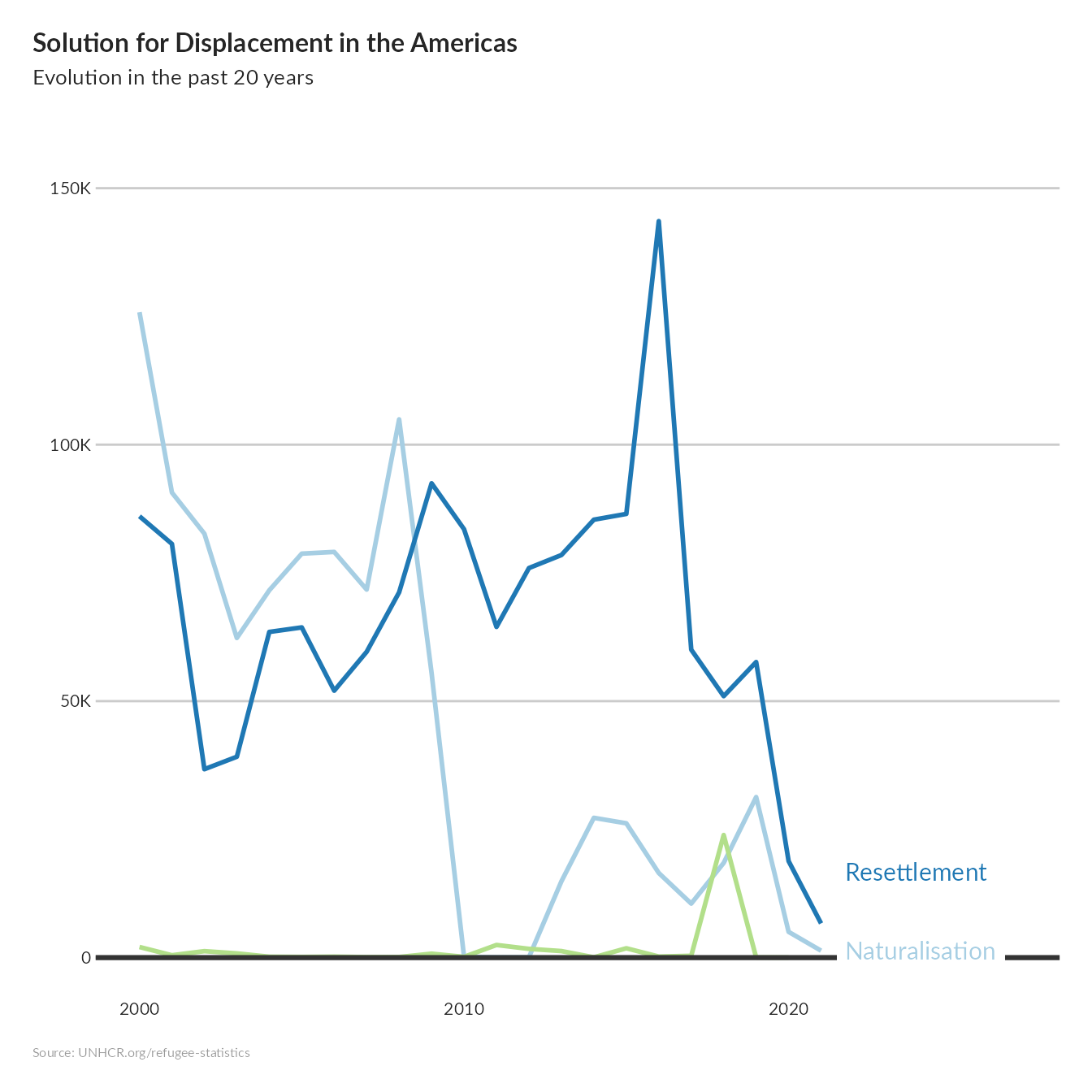
```