#Make plot
evol_america <- ggplot(multiple_line_df, aes(x = Year, y = Value2,
colour = Population.type)) + # Adding reference to color
geom_line(size = 1) + # Here we mention that it will be a line chart
# stat_smooth(size=1.5,
# method = "loess",
# level = 0.95,
# fullrange = TRUE,
# se = FALSE) +
geom_hline(yintercept = 0, size = 1.1, colour = "#333333") +
scale_y_continuous( label = scales::label_number_si()) + ## Format axis number
xlim(c(2000, lastyear + 7)) +
#scale_colour_viridis_d() + ## Add color for each lines based on color-blind friendly palette
scale_colour_manual( values = c("IDP" = "#00B398",
"VDA"="#EF4A60",
"ASY" = "#18375F",
"REF" = "#0072BC",
"OOC" ="#8395b9",
"STA"="#E1CC0D")) +
geom_label(aes(x = lastyear + .5 ,
y = as.numeric(multiple_line_df[multiple_line_df$Population.type == "REF" & multiple_line_df$Year == lastyear , c("Value2")]),
label = "Refugees"),
hjust = 0,
vjust = 0.5,
colour = "#0072BC",
fill = "white",
label.size = NA,
family = "Lato",
size = 4) +
geom_label(aes(x = lastyear +.5,
y = as.numeric(multiple_line_df[multiple_line_df$Population.type == "ASY" & multiple_line_df$Year == lastyear , c("Value2")]),
label = "Asylum Seekers"),
hjust = 0,
vjust = 0.5,
colour = "#18375F",
fill = "white",
label.size = NA,
family = "Lato",
size = 4) +
geom_label(aes(x = lastyear + .5,
y = as.numeric(multiple_line_df[multiple_line_df$Population.type == "IDP" & multiple_line_df$Year == lastyear , c("Value2")]),
label = "Internally Displaced \n Persons"),
hjust = 0,
vjust = 0.5,
colour = "#00B398",
fill = "white",
label.size = NA,
family = "Lato",
size = 4) +
geom_label(aes(x = lastyear + .5,
y = as.numeric(multiple_line_df[multiple_line_df$Population.type == "STA" & multiple_line_df$Year == lastyear , c("Value2")]),
label = "Statelessness"),
hjust = 0,
vjust = 0.5,
colour = "#E1CC0D",
fill = "white",
label.size = NA,
family = "Lato",
size = 4) +
geom_label(aes(x = lastyear + .5,
y = as.numeric(multiple_line_df[multiple_line_df$Population.type == "OOC" & multiple_line_df$Year == lastyear , c("Value2")]),
label = "Other of Concern"),
hjust = 0,
vjust = 0.5,
colour = "#8395b9",
fill = "white",
label.size = NA,
family = "Lato",
size = 4) +
geom_label(aes(x = lastyear + .5,
y = as.numeric(multiple_line_df[multiple_line_df$Population.type == "VDA" & multiple_line_df$Year == lastyear , c("Value2")]),
label = "Venezuelan Displaced \n Abroad"),
hjust = 0,
vjust = 0.5,
colour = "#EF4A60",
fill = "white",
label.size = NA,
family = "Lato",
size = 4) +
unhcRstyle::unhcr_theme(base_size = 8) + ## Insert UNHCR Style
theme(legend.position = "none",
panel.grid.major.y = element_line(color = "#cbcbcb"),
panel.grid.major.x = element_blank(),
panel.grid.minor = element_blank()) + ### changing grid line that should appear
## and the chart labels
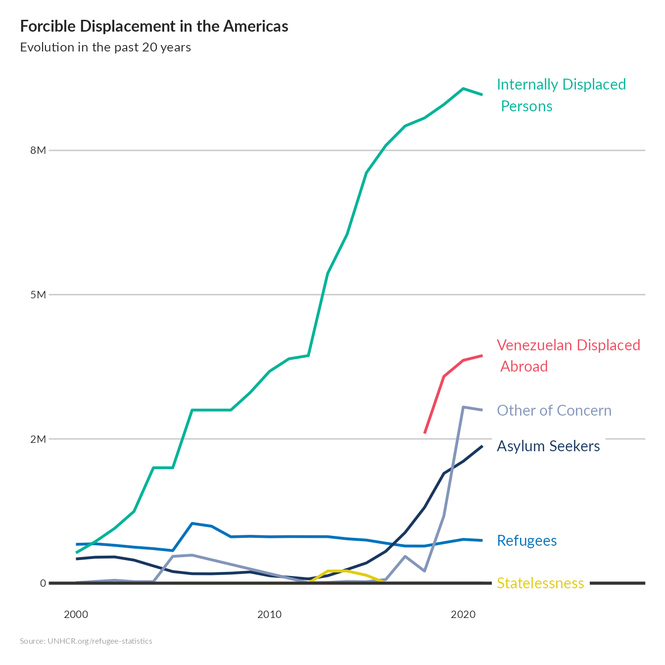
labs(title = "Forcible Displacement in the Americas ",
subtitle = "Evolution in the past 20 years",
x = " ",
y = " ",
caption = "Source: UNHCR.org/refugee-statistics ")
evol_america