Refugees accessing durable solutions
Source:vignettes/Refugee_accessing_durable_solution.Rmd
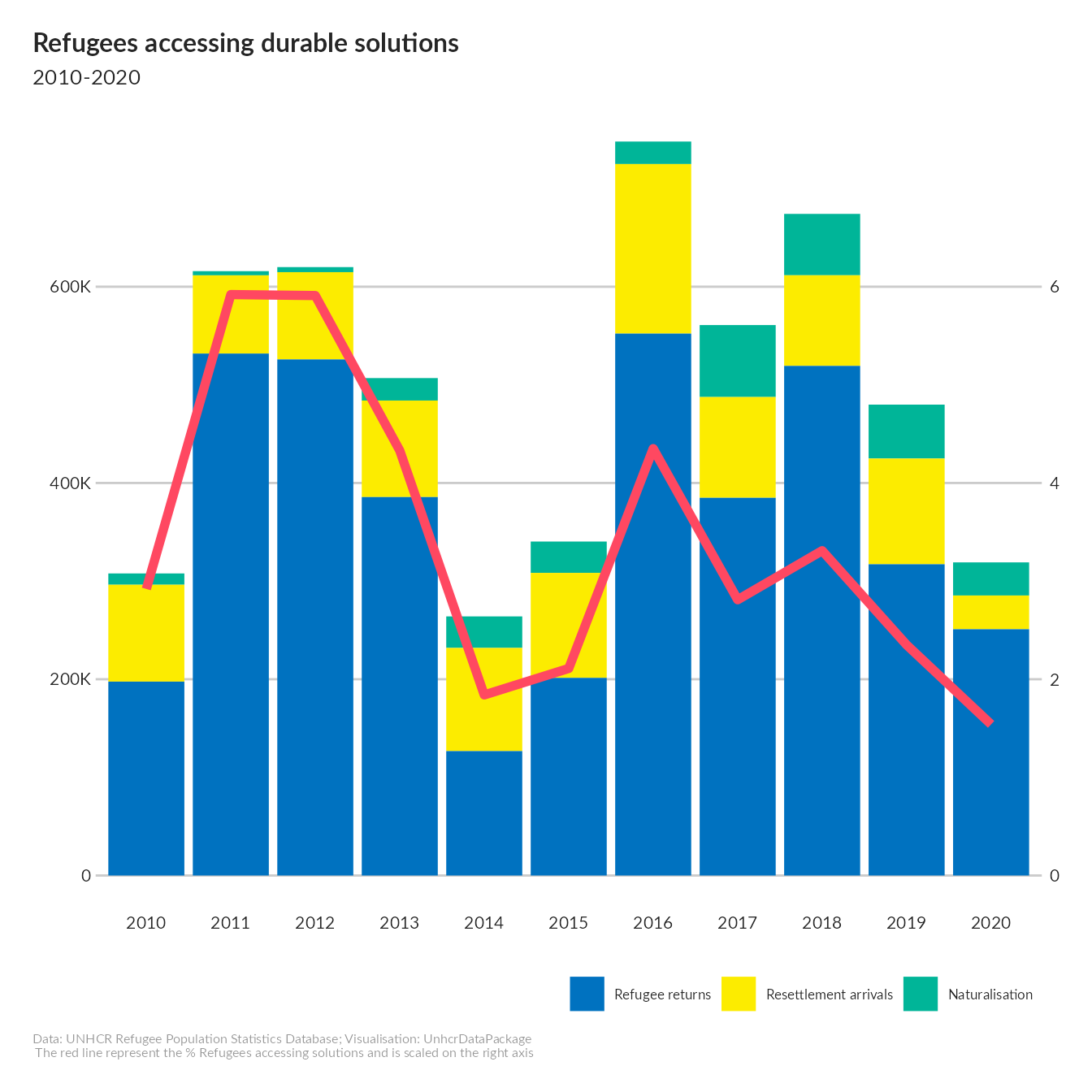
Refugee_accessing_durable_solution.RmdReproducing this chart - https://www.unhcr.org/global-compact-refugees-indicator-report/wp-content/uploads/sites/143/2021/11/gcr-refugees-receiving-durable-solutions.png
Prepare Data
solution <- unhcrdatapackage::solutions_long %>%
            filter(Year >= 2010  &Year <= 2020 ) %>%
            filter(Solution.type != "RDP" ) %>%
            group_by(Year, Solution.type,   Solution.type.label ) %>%
            summarise(Value = sum(Value) ) %>%
            mutate(Year = as.factor(Year),
                   Solution.type.label = factor(Solution.type.label,
                                        levels=c("Naturalisation",
                                                  "Resettlement arrivals",
                                                  "Refugee returns")))
#> `summarise()` has grouped output by 'Year', 'Solution.type'. You can override using the `.groups` argument.

## Now compile % of Refugees accessing solutions
refugee <- unhcrdatapackage::end_year_population_totals_long %>%
            filter(Population.type  %in% c("REF"))  %>%
            filter(Year >= 2010  &Year <= 2020 )  %>%
            group_by( Year) %>%
            summarise(Refugee = sum(Value) ) %>%
            ## order levels in factor
            mutate(Year = as.factor(Year)) %>%
            ## join for calculation
            dplyr::left_join( y = solution %>%
                                  group_by(Year) %>%
                                  summarise(Solution = sum(Value) ) ,
                              by = "Year")  %>%
            mutate(percent = round( (Solution / Refugee * 100),2))

solution2 <- dplyr::left_join(x= solution,
                              y = refugee %>%
                                  select(Year, Refugee,percent)  ,
                              by = "Year")
Generate plot
colorSolType <- c("#0072c0", # Refugee Return
           "#fcec00", # Resettlement Arrival
           "#00b598", # Naturalisation
           "#ff4861") # percent solution

solutionplot <- ggplot(data = solution2,
       aes(x = Year,
           y = Value,
           fill = Solution.type.label )) +
  geom_bar(position="stack",
           stat="identity") +
  scale_fill_manual( values = c( "Refugee returns" = "#0072c0",
                                 "Resettlement arrivals"  = "#fcec00",
                                 "Naturalisation" = "#00b598")) +

  # Adding percent
  geom_line(aes(x = Year,
                y = percent * 100000,
                group = 1),
            stat="identity",
            color = "#ff4861",
            size = 2 ) +
  scale_y_continuous(sec.axis = sec_axis(~./100000),
                     label = scales::label_number_si()) +
  ## Styling chart
  unhcRstyle::unhcr_theme(base_size = 8)  + ## Insert UNHCR Style
  theme(legend.position = "bottom",
    panel.grid.major.y  = element_line(color = "#cbcbcb"),
    panel.grid.major.x  = element_blank(),
    panel.grid.minor = element_blank()) + ### changing grid line that should appear
  ## and the chart labels
  labs(title = "Refugees accessing durable solutions",
       subtitle = "2010-2020",
       x = "",
       y = "",
       caption = "Data: UNHCR Refugee Population Statistics Database; Visualisation: UnhcrDataPackage \n The red line represent the % Refugees accessing solutions and is scaled on the right axis")

solutionplot